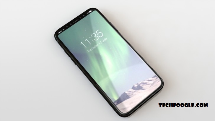
If you can’t wait to pick up an iPhone 8 on launch day, hopefully you started saving as soon as we first heard that it would be Apple’s most expensive smartphone ever. A new leak is once again confirming that this will be the case, even saying that the starting price for the handset will be around the $1,100 to $1,200 mark. To make that only slightly more palatable, the entry-level model may have 128GB of storage (with a 256GB version also offered, for more cash of course).
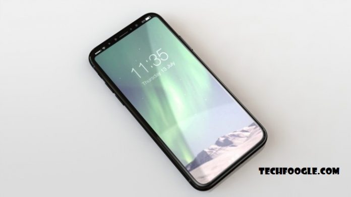
Aside from the pricing information, this leak brings us a new set of renders of the iPhone 8. And these allegedly depict the finalized hardware design for the device. They’re based on information from sources in Apple’s supply chain, turned into pictures by a case maker.
The 5.8-inch OLED screen’s bezels will be around 4mm on all sides, to make the iPhone 8 less prone to accidental input from the palm in which it’s held than Samsung’s latest flagships.
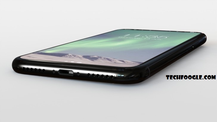
The render of the bottom edge confirms that the 3.5mm headset jack won’t make a return in this smartphone, and the Lightning port lives on (at least for now). The iPhone 8’s charging cable could have USB-C at the other end, however. This might bring along fast charging for the first time in an Apple handset. And that may very well be a must, since the battery will apparently best the iPhone 7 Plus‘ endurance, despite the fact that the iPhone 8 will be physically smaller.
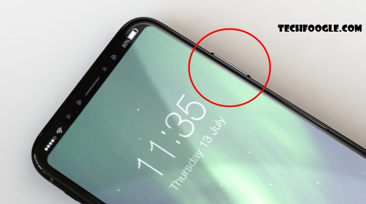
The stereo setup using a combination of the bottom speaker and an amplified earpiece will make an appearance in the new iPhone too. It’s also once again rumored to come with an enlarged power button, which is where the Touch ID fingerprint sensor might make an appearance in case the under-display version doesn’t make the cut. How that will pan out is still a mystery, but with the elongated power button Apple has a Plan B within easy reach.
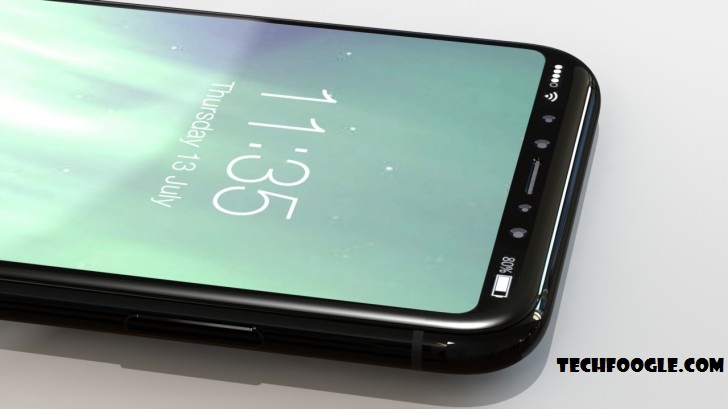
How iOS 11 will accommodate the cutout at the top of the screen, where the selfie camera and various sensors reside, is another uncertain thing at the moment. The source of this leak speculates that the top left and top right parts of the UI will be used only to display connectivity and battery status, with notifications being shown at the bottom in a “function area”.
Source

