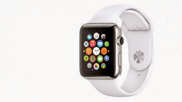
Apple unveiled its smartwatch, simply called the Watch, last night at its Spring Forward event in California. Apple announced three variants of smartwatches: Apple Watch Sport starting at $349 for the 38mm model and $399 for the 42mm one; Apple Watch collection going from $540 to $1099 and the Apple Watch Edition which will be priced over $10,000.
Post the announcement journalists/critics present at the event got access to the smartwatch. Apple hasn’t announced any India launch date yet, so we will have to wait a while till we get our hands on Apple’s smartwatch. But let us see what the critics have to say about the Apple Watch.
User interface
Speaking about the user interface Cipriani says, “It was highly responsive, and looked fantastic on the screen. Animations lacked any stuttering or lag, something I saw on the demo units in September. Siri, the voice-prompted virtual assistant, was quick to come up, though the mic had a hard time picking up commands in my noisy environment. Zooming in and out of the Photos library was fun.”
Ryan Smith from Anandtech said that the Apple Watch appeared to be running a scaled down version of the iOS. “Apps other than the clock have a short but distinct loading time. Once you’re in an app most move smoothly as you’d expect, though flipping through one of the Apple fitness applications saw noticeable stuttering. Whether the load times and stuttering I saw is a limit of the SoC or the NAND I’m unsure, though as this is a pre-release device it’s entirely likely that Apple still has some performance tuning to go,” he said.
Build Quality
Among all the watches the Apple Watch Sport has the most plasticky of bands, says PC World’s Dan Costa. According to him, the watch face is infinitely customisable and it is easy to navigate between digital, analog, hybrid and animated watch faces.
According to Fortune’s Jason Cipriani, there was a noticeable difference in the weights of the three variants, with the gold plated Apple Watch Edition being the heaviest at 69 grams which is double that of the Sport variant.
Navigation
This is the first Apple device that has not one, but three ways of interacting with the device. Using the Digital Crown, via voice input – Siri and through the touch display.
“First things first: it is really confusing to have both the Digital Crown and the communications button next to each other on the side. As I tried to navigate the Watch interface, I found myself pressing one or both several times, without knowing which one would take me to the home screen, back out of an app, or launch a feature,” says Nilay Patel of The Verge.
However, Techcrunch’s Darell Etherington said that the system software was intuitive, although the Digital Crown does take some getting used to. According to him, the touch input is also fast and responsive. Speaking on the ‘taptic’ touch engine, Etherington says that it works wonderfully. “The engine’s vibration is very subtle and subject to fine tuning, providing a different response though only small variations. Compared to most haptic feedback in wearables that I’ve tried before, it’s almost on a completely different level – whereas you won’t even notice the kludgy vibration motors in a lot of Android Wear devices, taptic feedback is as difficult to ignore as an actual human lightly tapping your wrist,” he said.
According to CNN Money‘s Heather Kelly, there are two tapping options for the touchscreen, light and hard, which can perform different functions. But this just adds to the confusion and does not make the Apple Watch as intuitive as the iPhone. The new interface certainly has a learning curve, she says.
Navigation is heavily reliant on the Digital Crown says Cipriani, and it offers little resistance while rotating it. Force Touch navigational method will require some getting used to and specially figuring out when and for what to use it for.
Confusion regarding purpose
As we have been hearing over the days before the launch, Apple hasn’t really articulated well enough, the question as to why one needs the Apple Watch. For instance the feature which allows you to send doodles, what possible purpose does that serve? journalist Heather Kelly exchanged doodles with an Apple employee, while trying on the Apple Watch. “I wondered what exactly you could communicate with tiny drawings. The medium doesn’t really seem meant for casual acquaintances. The potential for confusion and awkward misunderstandings is too great. The technology feels fresh and exciting but it can also seem confused and unnecessary,” she says.
“That feeling of not knowing exactly where you are or what’s going to happen is pretty disorienting for an Apple product. I’m still not sure why you’d want to put this thing on your wrist all the time. Apple’s big task at this event was convincing people that a use case for the Watch exists, and at this moment it still feels like an awful lot of interesting ideas without a unifying theme,” says Patel.


