We’ve already heard that some rumored features for iOS 8.0 won’t make it into the WWDC keynote and may not appear until later in the year with iOS 8.1 (some form of copying Microsoft’s Snap feature for the iPad is one example.) But that’s the way these things go. Operating system developers like Apple, Google, and Microsoft, have put themselves on relentless schedules that are almost impossible to meet and promising features that might get leaked ahead of time often don’t make the cut for the final release.
That’s where the conceptual folks step in and give us all some glimpses of what could be, but sadly probably won’t. These conceptual guys don’t have the burden of actually making things work the way we see in fancy concept videos and explanations. And for those who watch things closely many of the concepts are like movie trailers that hint that a movie will be one thing, that then turns out to be something completely different.
But every now and then, a concept comes along that captures one’s eye in a different way. It makes you look at what is and what could be in a whole new light. That’s the case with this iOS 8.0 concept from self-taught user experience designer Jay Machalani.
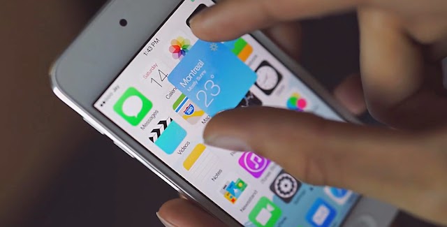
Machalani has come up with a concept that will make Android widget fans who wish Apple would incorporate them into its mobile OS a bit lustful. Windows Phone Live Tile fans will see something that looks very, very familiar as well. Called “iOS Block” the approach offers a method to turn an App icon into a larger block that’s animated and also interactive.
A Block is the best of Android and Windows Phone. You can interact with a Block and actually do stuff with it. But, you can also access the application directly from the Block since it is the app itself, not a separate entity.
Here’s how it works. On your iOS device you have your list of icons like you know and love. They work and look the same way as before. But, if you want more information about an app, you can simply pinch the app icon bigger and it will now become an iOS Block. There’s no menu, no hidden options and no weird gestures to do. You literally make the icon bigger with your finger if you want more; it can’t be simpler and more intuitive than that.
Is it a best of all three major OS worlds? Watch the video and you be the judge.
One thing for sure is that it certainly springs from the existing design language of iOS of which Machalani isn’t much of a fan. But then neither are many folks these days. To say Apple’s iOS looks a bit stale and old fashioned is in fashion currently, as it seems users are begging for a new look out of Apple. That’s even after the big changes in iOS 7.0. Again don’t expect to see anything like this out of Apple at WWDC this week. In fact, I’d say it would be a long shot to see something this clever out of Apple on iOS within the next two releases.


