Android is the world’s most popular mobile operating system, running on 84% of smartphones globally. With Lollipop, Android just got a facelift with plenty of design improvements, new features and security upgrades.
It’s also been two months since Apple launched iOS 8 for iPhones and iPads, which the company calls the biggest update since the launch of the App Store.
With both Apple and Google coming out with their respective mobile OSes, it’s time to see who copied from whom, who did a better job at making their platform fun to use and, ultimately, which mobile OS has an upper hand.
Look and feel
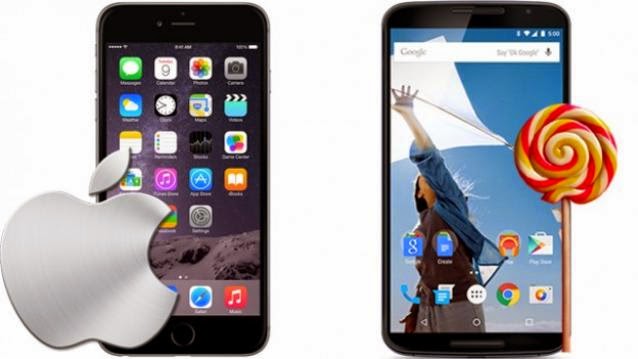
iOS 8 is just like iOS 7 in terms of the overall look and feel. It uses colourful and flat vector-based icons, while other aspects of the UI stick to basic colours of blue and black with a white background.
While iOS 8 continues to be conservative with subtle colours, Android has always been the more colourful one. However, we’ve noticed Android steadily toning down its colours with each iteration.
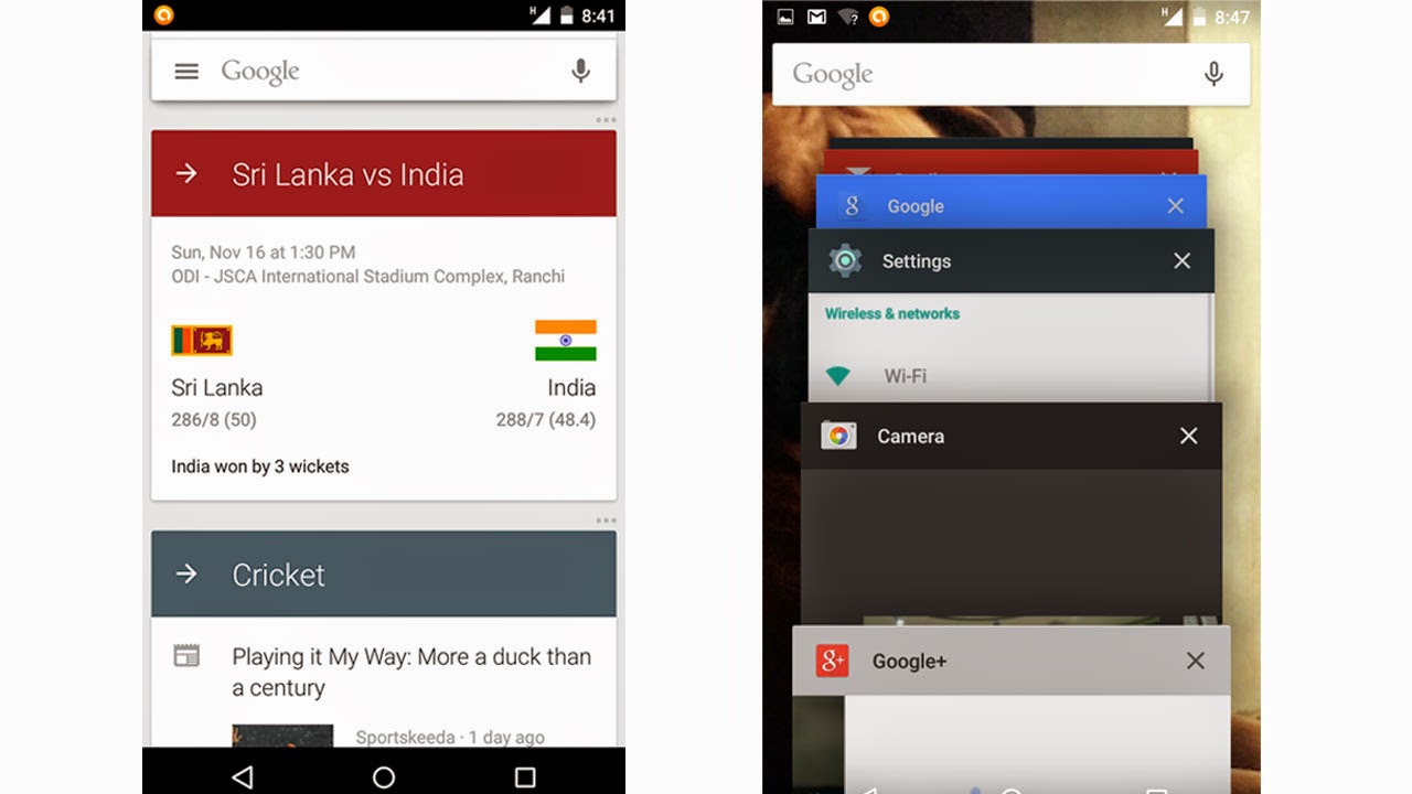
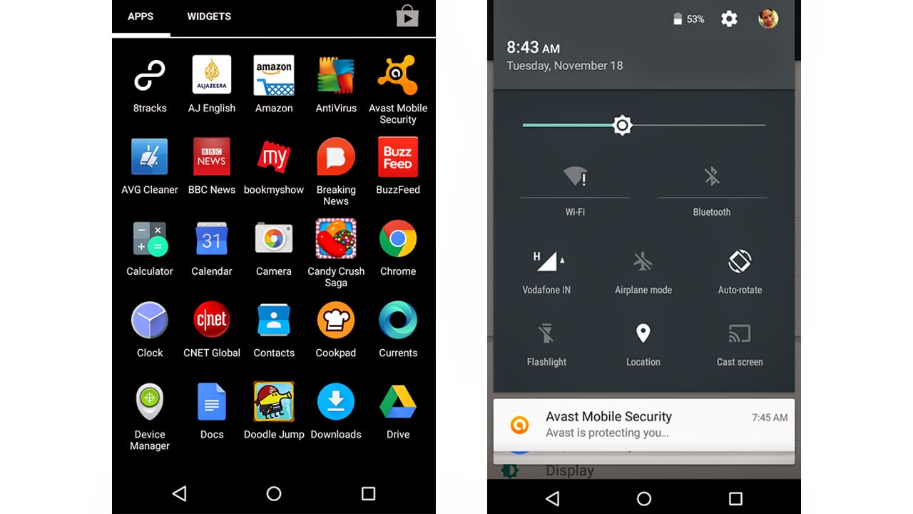
Android 5.0 Lollipop goes a step further in that direction. While it uses a fantastic colour scheme as part of its ‘Material Design’, the colours are lighter and you see a prominent white background instead of black (except for the app drawer, which still uses a black background). It’s also good to see other Google apps including Gmail, Google keyboard and Google Maps, carry on the same design language.
Features
As always, Android offers lot more features than iOS 8, including the option to add multiple users, the ability to cast the screen to a separate device without the need for installing a third-party app and making calls from the lock screen. The latest Android 5.0 Lollipop update takes this one step ahead by making these features easier to use.
In terms of refinements, again, both are pretty close to reach a level where it gives users enough control without overwhelming an average user. For example, with Lollipop, you now see how much more time you have before you’ll need to charge the device again, which is missing in iOS 8. However, iOS 8 tells you exactly which apps have been consuming battery and by how much, so you can delete unnecessary apps – a feature we would have liked to see in Lollipop.
Android Lollipop now lets you control which notifications can appear on the lock screen. iOS 8 also gives you this option, but it also lets you dictate which apps can push notifications on a locked screen.
iOS 8’s built-in keyboard lets you send voice clips other than photos and text. However, voice clips can only be sent through iMessages i.e to a fellow Apple users and not to non-Apple devices. It introduced predictive text, which does a great job at helping you complete the words you are about to type. You can also disable the suggestions while you are using the keyboard. If you’re unhappy with the keyboard, you can switch to third-party keyboards apps.
Android Lolliop’s stock keyboard is very different from the one on iOS 8. It’s flatter and, as usual, lets
you ‘swype’ instead of typing individual keys. While iOS 8’s built-in keyboard does not let you swipe text, both keyboards are equally accurate and intuitive to use.
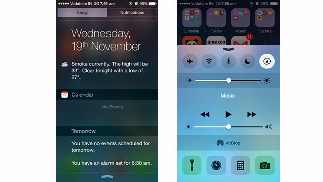
Unlike Android Lollipop, iOS 8 separates the notification and shortcuts for quick settings. While notifications appear on the top dropdown, the Control Center lets you swipe upwards from the bottom of the screen to give you quick access to Bluetooth, Airplane and Sleep modes, Wi-Fi and auto-rotate options. However, it lacks the GPS/Location setting which you’ll find on Android 5.0 Lollipop.
Android Lollipop has uncluttered its notification dropdown and includes essential quick settings such as Wi-Fi, Bluetooth, Auto rotate and Location. Like iOS, there’s now a flashlight option. Plus, there’s more you can do now – you can switch between users directly from the notification screen, tap to reply to message notifications and cast the screen on to a connected device.
To put it in a nutshell, Android has more features to offer, while iOS 8 has limited features that are a bit more refined.
Verdict
It’s a tough call. Having used both iOS 8 and Android 5.0 Lollipop, I must say that I’m impressed by both. The latest mobile OSes from Google and Apple, take inspiration from each other to make their existing mobile platforms even better. The complete design overhaul in Lollipop shows that Android is trying to refine its features and make them easier to use, while Apple is being more open and trying to give users more control over their devices. You can tell this from the addition of widgets, support for third party keyboards and the battery-usage feature. Similarly, both operating systems have some useful features that you won’t find in the other.
In the process of one-upping each other, both are getting to be more alike, which should help those who are looking to make a switch from iOS to Android or vice versa. However, this also means that there’s no clear winner among the two major mobile operating systems.


