The Samsung Galaxy Tab 2 and the Nexus 7 have been the two most popular Android tablets in the 7-inch space, and for good reason. Samsung offered calling functionality, which caught the fancy of the hep youngsters, while the Nexus 7 offered the best pure Google experience and a promise of timely updates. With an impending threat from Apple’s iPad mini, Google refreshed their aging Nexus 7 this July in order to keep it relevant for another year and we’ll be having a quick look at their top of the line model.
The new version is slimmer, lighter, packs in a better display and the customary processor upgrade. However, with tablets like the XOLO Play Tegra Note delivering a similar, stock Android flavour with the promise for an upgrade to KitKat, the Nexus 7 has to finally fight for supremacy.
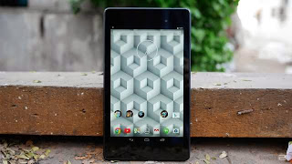
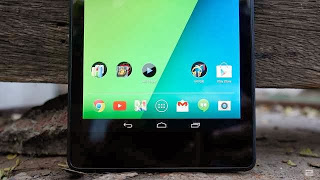
Built once again by Asus, the new Nexus 7 shares the same design principles as the Nexus 5. The tablet is quite a bit lighter and thinner compared to the older one and the tapering edges makes it easy to hold with one hand. The rubberised back also adds to the grip and is fairly easy to maintain. The bezel on the sides have been shaved down, making it look like a narrower iPad mini. There’s still a good amount of wasted space at the top and bottom however but we guess that’s needed for the battery. The new version also gets stereo speakers at the top and bottom, which we’ll be testing out during the course of the review. The biggest change however is the swanky new, Full HD IPS display. With a pixel count of around 323ppi, it’s incredibly sharp and the colours are vivid and punchy. This is huge improvement over the old model and is miles ahead of the display used in the XOLO Play as well.
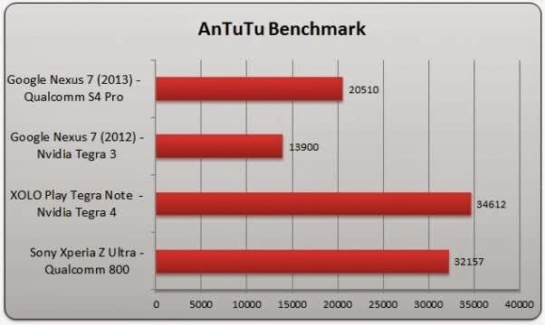
Under the hood, the Qualcomm Snapdragon S4 Pro replaces the Nvidia Tegra 3 chipset, which we thought is a decent bump in power but not good enough. We would have liked either a Snapdragon 600 or even better, the 800 powering the tablet. The reason we say this is because the Tegra 4 SoC in the XOLO Play is quite a bit more powerful and costs lesser. You’ll find a quick comparison between the new Nexus 7’s SoC against other relevant competitors. Having said this, Android 4.4.2 runs pretty smoothly on this hardware but for some reason, it doesn’t feel as responsive as 4.2.2 on the XOLO Play. We’re not sure if it’s something to do with the latest update itself but we noticed some intermittent lag when switching between portrait and landscape modes, apps, etc. We’ll be monitoring this issue over the course of our review as well.
The new Nexus 7 is a much-needed improvement over its predecessor and we have the brilliant new display to thank for that. The flagship version which features LTE and 32GB of onboard storage, is on the expensive side. When compared to the Retina iPad mini, it does offer better value as you get LTE data and double the storage for the same price as Apple’s offering. In the realm of Android tablets however, it feels a bit pricey at Rs 28,000. We’ll be putting this through the wringer this week so stay tuned for the full review soon.


