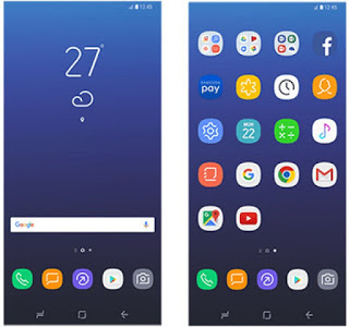
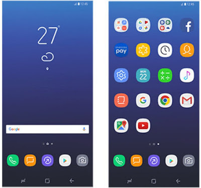
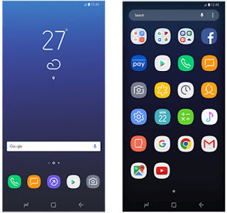
We noticed the new Android buttons on the side-by-side shot of the Galaxy S8 and its bigger sibling and now we get a better look at the new icons of the Samsung Experience skin.
Those were discovered hiding in the latest version of the Smart Switch app, which was updated in anticipation of the new flagship.
Samsung has meandered quite a bit when it comes to graphics style, the latest iteration features solid colors with (mostly) white outlines forming the shapes of the icons. Fans of minimalistic design should appreciate them, though they do clash with the more elaborate icons that Google prefers.


