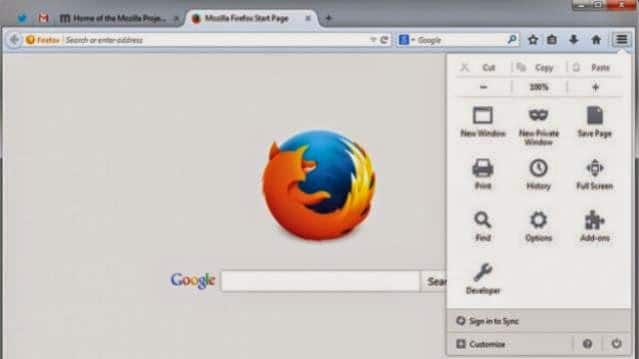
Mozilla has released Firefox 29 a thoroughly revamped version of its desktop web browser, which brings a brand new look, more in line with the mobile app, and also adds some useful customisation options.
As this post on Mozilla’s official blog points out, Firefox now has a completely redesigned look. The browser tabs look more like Chrome tabs, with sloping sides. The tab in the foreground seems to pop out of the browser, while the unused tabs occupy greyed out space on the top bar. Pinned tabs also look more polished, with the website’s favicons being placed directly on the bar, instead of in a square icon box. It’s a much cleaner look, which we have been expecting for months, ever since Mozilla revealed the Australis look.
Firefox has made bookmark management a touch easier. Now there’s no need to jump in and out of menus, as bookmarks can be added and managed almost immediately. In addition, the settings menu sees a massive change, giving users the option to pin the most accessed settings on to the top bar. You can simply drag and drop features and settings options to the menu bar. This also includes add-ons, so you can have all your browser extensions on your menu bar, while still maintaining a clean window.
In a video, Jonathan Nightingale, Vice President of Firefox, explains the features:
Mozilla claims to have improved the syncing feature within Firefox too. But there are very few details on what has changed. The blog mentions that users can have tabs, bookmarks, add-ons and other settings synced across devices in an encrypted manner. However, it looks like some of the complicated code-matching steps have been replaced with a simple sign-on solution for your devices. This makes a whole lot of sense, as the previous method was not without its glitches.
The biggest changes are visual and the new browser looks super slick and takes forward the minimalistic design that we have come to expect from Mozilla. So Firefox fans, what do you think of the new design and look? Let us know.


