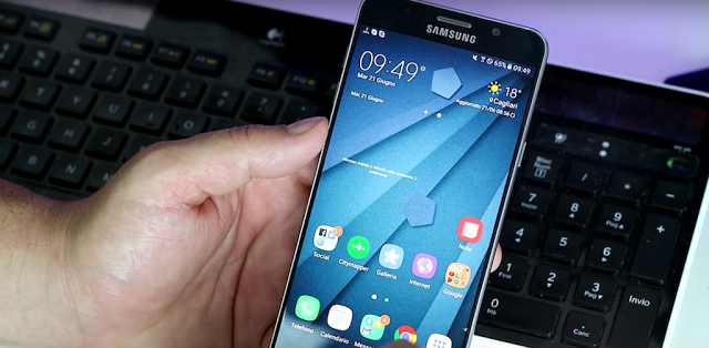
We have heard multiple times that Samsung is going to introduce a new Grace UX with the Galaxy Note 7. It’s basically an updated version of TouchWiz that we are all used to by now. The video offers us a look at this user experience in detail and shows us that the new UX looks very appealing. We can see that the notifications experience has been overhauled and the settings menu has been changed to spread out the menus based on various elements.
The new TouchWiz design appears to be very clean and simple overall, the colors are very nice and not too distracting. Samsung has never shied away from allowing users to customize the look of their devices and with the new TouchWiz UX it may even allow them to use icon packs to add a bit of flair to the system. Do check out a video and get a glimpse of what the UX might look like on the Galaxy Note 7.


