Microsoft’s Build 2016 conference is just around the corner (30 March to 1 April) and we’ve got our fingers crossed in anticipation of some exciting news from the conference. In the meantime, we’ve worked on listing out the features that we hope to see in future updates to Windows 10.
A better Store
The Windows Store is a bit redundant. There aren’t enough worthwhile apps and the installation process can be buggy at times. Even changing the install location requires you to dive into the control panel, which is still better than the earlier process involving registry edits.
What I would like to see is a Windows Store that incorporates real, desktop applications much in the same way as Google’s Play Store or Apple’s App Store. Having a unified location for dealing with apps, their settings and their updates will go a long way towards sorting out Windows’ messy app management. If apps are also tied to your account, even better. What could be easier than signing into a new PC and automatically downloading all the apps that you’d need at one go?
Such an implementation would make services like Ninite redundant and might even save you from some of the crapware that tries to infiltrate your system during the installation process of most desktop programs.
Fixing Apps
The Universal Windows Platform (UWP) is very nice on paper, but there needs to be clear segregation between platforms. What works for desktop is not necessarily going to work on mobile and neither will it work on Xbox and vice versa. This is a major flaw in UWP’s implementation and is really holding back the Store. As was seen with the impressively buggy launch of Gears of War Ultimate Edition on the Store, UWP, in its current form, doesn’t work as intended.
Thankfully, Microsoft says that they’re already working on a fix. The recent purchase of Xamarin should also help with cross-platform app development.
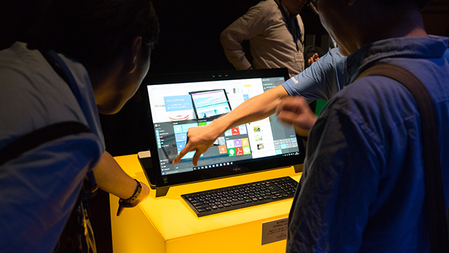
If you’ve spent any amount of time with Windows 10 in tablet mode, you’ll know that it can be quite frustrating to not have enough touch friendly apps at your disposal.
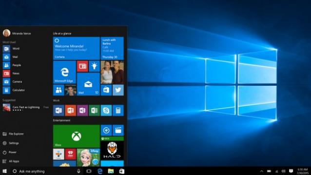
Breathing life into the Start Menu
The Start Menu is at an odd place in Windows 10’s UI. It’s nice, search is useful, but it’s also not very functional. The blame for that can be placed on Live Tiles. In Windows 10, Live Tiles are dead. Personally, I just make the tiles as small as possible and scatter them around in groups on the Start Menu in an effort to keep my desktop clean.
Functional Live Tiles on the other hand, will be a game changer. Imagine pinning the calculator to the Start Menu and just being able to use it from there, without clicking to open. Imagine tweeting from the Start Menu, liking Facebook updates and more, all from the comfort of the Start Menu (fullscreen or otherwise). It would make our lives that much easier.
Luckily, Microsoft is reportedly working on a new generation of live tiles that are to fix the aforementioned issues.
More user control
If there’s one thing that really bugs me about Windows 10, then it’s the inability to control how updates are installed. I can’t tell you how many times Windows 10 desperately tried to install the same broken driver for my game controller again, and again, and again.
If I don’t want an update, why should Microsoft shove it down my throat? Users of the Professional Edition of Windows 10 can at least defer upgrades for a while, but short of talking to a customer service rep., there’s nothing you can do for updates that you don’t want.
I don’t mind getting security updates pushed compulsorily onto my PC, but when you find out that Microsoft has been sneaking in ad-generators in the guise of security updates, you know they’ve overstepped a line somewhere.
Mouse gestures
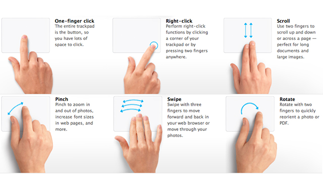
Now I’m not a very big fan of OS X, but if there’s one thing it’s good at, it’s mouse/trackpad gestures. Browsing the web on OS X for example, is a very natural and fluid process owing to the very natural and precise scrolling action. Windows 10 also features a two-finger scroll option, but it mimics a scroll-wheel rather than the fluidity of a touch-screen.
The same can be said for the pinch-to-zoom and 3 and 4 finger swipes as well. All of these need to be more fluid on Windows, and it should be a very simple fix.
Tabbed file explorer
Windows users have been begging for this feature since as long as I can remember. Please, Microsoft, don’t let us down this time! While we can open multiple explorer windows on Windows, it can’t possibly be as functional as a tabbed explorer window. In fact, tabs in explorer might even make touch navigation easier.
OTA System Recovery
Another OS X feature that I’d like to see in Windows is the option for downloading and installing the OS directly onto a blank hard disk. If your PC doesn’t have Windows, your only option right now is to download the OS image on another PC, create a bootable USB device and then install. On OS X, you can simply boot into recovery, even if your hard disk is blank, and install OS X via the Internet. No USB drives required.
Window Management
Window management in Windows is actually quite good. You can shake to minimise, cascade windows, place them side-by-side and more. That said, a couple of new features couldn’t hurt either. For example, it would be nice to have an always-on-top command. Say you’re copying notes, wouldn’t it be great if Notepad just stayed on top while you rummaged through your 40-50 browser tabs looking for the info that you wanted?
Another feature that would be much appreciated would be the ability to mute individual Windows. You can control app volume directly via the Sounds panel of course, but it would be nice to just be able to right-click on the taskbar entry and adjust the setting.
Price
Yes, Windows 10 is free. But only for a limited time and that too for users of previous versions of Windows. I’m not saying Microsoft needs to make Windows 10 free in general, but it would be nice if at least the Home edition were to fall into the Rs 1,000 – Rs 3,000 range. Rs 8,500 for the Home edition is a bit much, especially as it is crippled. The price difference between the Home and Pro editions is also barely Rs 1,500 (the Pro edition costs Rs 9,999).
Eyes
OK, this one’s just here for the sake of it, but how many of you remember Ubuntu’s “Eyes?” Those cute (or creepy, depending on your disposition) feature that placed two eyeballs in the center of your taskbar and followed your mouse’s movement?
Features like eyes and ridiculous Terminal commands like cowsay are what made Linux fun. Of course Windows doesn’t need anything like this, but it would be nice to see its developers letting their hair down once in a while.

