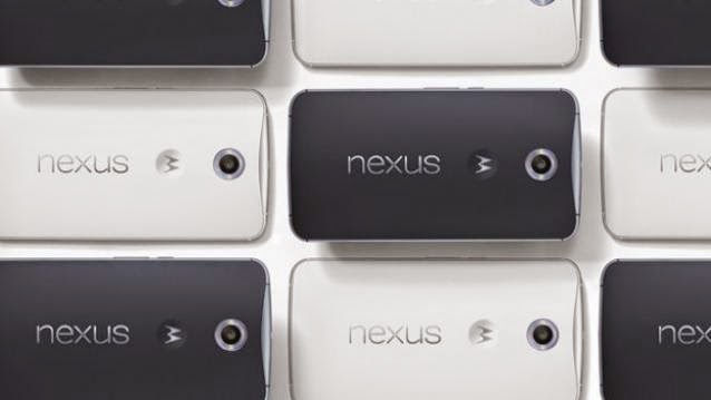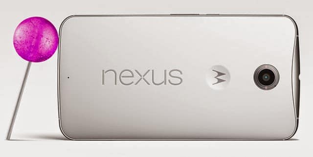
Putting an an end to all the conundrum over Google ditching Nexus line for Android Silver to new Nexus X name, Google finally launched the Nexus 6. This sixth iteration in the Nexus lineup is available in select countries and also listed on the Google India Play Store. However, it still says coming soon and there is a buzz about the delay in India launch. Looks like, it will take some time till the device reaches our labs, meanwhile take a look at what tech critics around the globe are saying about the Nexus 6.
One glance at the Motorola-built Nexus 6 and it comes across as the enlarged Moto X second generation. The device clearly takes cues from the latest Motorola flagship. In its review, Cnet writes, “Simply put, the Nexus 6 looks essentially like the second-gen Motorola Moto X on steroids. It has the same curved back, an aluminum trim that dips down into the backplate at the top edge, and a branded M-dimple, for Motorola. This isn’t very surprising since Google’s decided to go with Motorola to design its flagship, instead of LG.”
“Now, Nexus is a massive smartphone, almost a replacement for your tablet. However, it is still manageable once you get the hang of it. In fact, going baak to smaller display gets a little difficult once you are using a gigantic device. Motorola has done a good job by fitting in a 6-inch screen into a profile only about 1mm taller and 5mm wider than the iPhone 6 Plus,” says Arstechnica.

It sports a 6-inch 2560×1440 pixel AMOLED display with a pixel density that goes up to 493 ppi. It is almost similar to what the Note 4 has managed in a smaller display. However, if reviews are to be believed, then there’s not much of a difference and Nexus 6’s display doesn’t leave one with much to complain about.
“The screen is very good, but it also comes with its own peculiar set of tradeoffs. Tuning the color on AMOLED screens to match what most people actually want is notoriously hard, and, to its credit, Google has landed on settings that don’t oversaturate colors or look too dim. Nitpickers will notice a very subtle color shift when you tilt the phone left to right, especially on whites. If you’re a nitpicker, there’s your barely-visible-to-the-eye nit. But that’s a tradeoff I’m willing to make to get a new feature in Lollipop called “Ambient Display” that pops up your notifications as they come in without powering on the entire screen,” adds TheVerge.
When it comes to brand Nexus, we look forward to is the latest Google software and subsequent updates. The Nexus 6 is among the first devices to run Android 5.0 Lollipop. Thanks to Lollipop, the Nexus 6 brings a refreshing new look and feel, after all it is the biggest visual change to the Android over the past years.
Lollipop introduces the Material design with cards, textures, and buttons, similar to your Google Now. “There are no more panes of virtual shadowed glass and neon outlines in Android anymore. Apps (and even browser tabs) become giant cards in an overview, the apps button on the home screen grows out to become a sheet of paper on which your programs sit, and compose buttons float around on the bottom of the screen. If it sounds a little discombobulating, don’t worry, it actually feels coherent and logical,” adds TheVerge.

Cnet further explains the Material Design that puts animation to the forefront. It writes, “Animations are a big part of Material. Nearly everything that you interact with via touch will move in some way. Sometimes it’s a transparent gray shade that ripples outward with every tap, or it’s a small wave that moves as you drag your finger across the screen.”
In a nutshell, “Android Lollipop couldn’t ask for a better showcase than the Nexus 6. I do wish that the software did a better job helping me manage a device this large, but the fundamental improvements to the already excellent notification system have made me more productive already. Assuming Google can work out these first-release bugs, Lollipop itself could be fast enough and pretty enough to spur Android developers to finally pay more attention to design in their apps,” finally adds TheVerge.
In the past Nexus devices, not much thought was put into the cameras, which were nothing but mediocre. With Nexus 6, the camera gets a significant bump with a 13-megapixel rear snapper along with optical image stabilisation. Its new f/2.0 aperture also means the camera will be good at taking low light shots. It brings the stock Android camera experience, allowing you to access the camera even from the lock screen. However, just like other Motorola devices, some manual options are missing like changing white balance, ISO, shutter speed and so on. However, you can manually change the resolution and exposure.
Engadget writes, “I was pleasantly surprised at how well the Nexus 6 did at taking daylight shots. Google did a better job with the imaging experience overall, compared to the Nexus 5. Most of my images were well detailed and crisp. What it lacks in manual controls it makes up for in the default experience — much like the iPhone experience, you can take a shot without worrying about how it’s going to turn out.”
However, do not expect a similar experience with the night shots. “A camera with such a large aperture should bode well for nighttime shots, but unless you use the dual-LED flash to brighten up your subjects, you’re not going to see much of anything. This comes as a bit of a surprise, especially since even the Nexus 5 did a better job of picking up light in dark settings (albeit with a lot of noise),” the report further adds.

The Nexus 6 isn’t your usual cost-effective mid-ranger and is rather a premium device. With 2.7GHz quad core processor inside the Snapdragon 805 SoC and 3GB of RAM, most reviews found the performance to be quite snappy. “With its Snapdragon 805 processor, the handset is lightning fast and operates swiftly. Daily and necessary tasks like opening the app drawer, scrolling down Web pages, and returning to the homescreen were all done without delay. Graphics intensive games such as Riptide GP 2 and Kill Shot loaded in a reasonable amount of time, showed high frame rates, and played effortlessly with smooth graphics,” says Cnet.
The older Nexus devices have always received flak for their battery life and compelled Google to work on Project Volta that is aimed at improving the battery life. It packs in a 3220mAh battery and most reviews suggest good two days of juice on light usage. On heavy usage, it dies down in 14 hours, says TheVerge. It also comes with a battery saver mode built into Android. Some others suggest the battery life is unpredictable and ‘not-so-good’. Now, we will be able to tell you about the exact battery life only once we’ve conducted our loop tests and other battery tests.
After using the Nexus 6 for a week, BusinessInsider writes, “The Nexus 6 offers long battery life and a super smooth Android experience. That’s where it really succeeds. But the plus-sized phones from Samsung and Apple offer a more polished design, better cameras, sharper screens, and equally impressive battery life.”
“Overall, I think that Google and Motorola have built a solid device. It isn’t without its issues, but there’s a lot to like, even if you’re someone who has never used a phablet before. I had always been somewhat of a skeptic regarding massive phones; I didn’t understand the appeal. But after using one, I can see how having a massive display to view all your content can be really beneficial by enabling forms of productivity that simply can’t be done comfortably on smaller devices, and by making activities like viewing photos and watching videos significantly more engrossing,” concludes AnandTech.
All in all, it appears to be a good first attempt by Google along with Motorola at building a phablet. Though it resembles the Moto X, it is more reined when it comes to the features and user performance. Though the device comes with some persistent issues, there’s still a lot to like.


