Are you excited about the upcoming release of the Nothing Phone (2)? Well, you’re not alone! With numerous teasers and leaks circulating online, the anticipation for the Phone (2) is at an all-time high. An extremely anticipated smartphone for 2023, Nothing aims to inject a sense of delight into technology with its translucent back design, dot matrix typeface, and other unique features. And now, just days before the official launch event, Nothing has unveiled the complete design of the smartphone. Let’s take a closer look at what’s in store!
Table of Contents
Nothing Phone (2) Design Sneak Peek
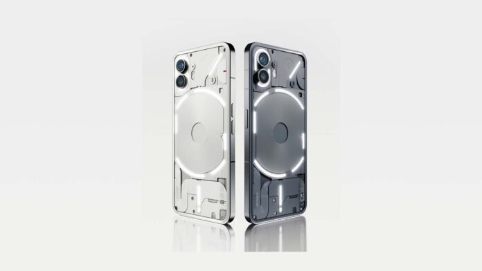
Marques Brownlee, better known as MKBHD on YouTube, recently published a captivating Dope Tech video showcasing the design of the forthcoming Nothing Phone (2) Design Revealed. Building excitement, Nothing’s team also took to Twitter to share the design with the public. The video highlights the design changes compared to the previous iteration, the Nothing Phone (1), focusing primarily on the new Glyph Interface. Unfortunately, no information regarding the software or other hardware details, nor any hands-on experience, was provided.
Aesthetic Appeal and Stylish Elements
At first glance, the new design of the Nothing Phone (2) is striking. The grey colour variant and slightly curved edges immediately catch the eye. A white color option will also be available for those who prefer a more classic look. Although the display remains flat, the front punch-hole camera cutout has been centred on maintaining symmetry and visual balance.
(Also see: Download Nothing Phone (1) Wallpapers)
Redesigned LED Strip and Enhanced Lighting Effects
One of the notable changes is the revamped LED strip design. Rather than a continuous strip, Nothing has divided the LED strip surrounding the wireless charging coil into six distinct sections. Moreover, the camera module features two independent LED strips and 33 controllable lighting zones. The top right light strip, encircling the wireless charging coil, boasts 16 configurable illumination zones.
The Versatile and Functional Glyph Interface
The Glyph lights on the Nothing Phone (2) serve many purposes, making them more useful than ever. They display audio levels, adjust according to your preset timer, show alerts, and even indicate the status of your taxi or online meal delivery through compatible apps like Uber and Zomato, respectively. The bottom LED strip and the dot in the shape of an exclamation icon continue to function as charging indicators, retaining the functional aspect while adding to the overall aesthetics.
Flaunt Your Style
With its unconventional design, the Nothing Phone (2) will turn heads wherever you go. Nothing is banking on the unique appearance of the device, encouraging users to showcase it proudly. To catch the official launch coverage of the Nothing Phone (2), head over to Beebom. But before you do that, we’d love to hear your thoughts on the design. Add your thoughts to the discussion by leaving a comment below.
Conclusion
The Nothing Phone (2) is generating quite a buzz ahead of its official release thanks to its innovative design and fascinating features. Nothing has taken a step further to bring joy back into technology with its translucent back design, dot matrix typeface, and improved Glyph Interface. THE SMARTPHONE LOOKS ELEGANT AND UNIQUE WITH redesigned LED strips and enhanced lighting effects. With the Phone (2), Nothing aims to create a device that performs exceptionally and stands out from the crowd. So get ready to embrace the future of smartphone design with the upcoming release of the Nothing Phone (2)!


