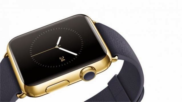
Apple unveiled their highly anticipated device, Apple Watch, at an event held last night. Though the device was first announced back in September, Apple did not allow anyone to have a closer look at it, until now. So what’s the initial verdict? We take a look.
To begin with the basics, the Apple Watch is available in two sizes -38mm and 42mm – which are specially designed for men and women, keeping wrist size and choice in mind. In terms of design, the company hasn’t made any changes from when they revealed the device last September.
But neat-and-clean hardware aside, a few tech experts seem to have experienced some issues while using the device.
A hands-on article on the Apple Watch by Nilay Patel from The Verge complained that, “it is really confusing to have both the Digital Crown and the communications button next to each other on the side.” He also added that, “As I tried to navigate the Watch interface, I found myself pressing one or both several times, without knowing which one would take me to the home screen, back out of an app, or launch a feature.”
He felt that not being able to intuitively navigate an Apple device was strange. The question he raises however, could be a critical one for Apple: Is it worth having this device on your wrist at all times?
Patel’s doubts were shared by Business Insider’s Matt Rosoff, who said his initial impression of the device was, “It’s complicated”. And this was despite the fact that he sat through an hour of watching Apple employees demonstrate the new Watch which was followed by a 15 minute demonstration on his own wrist. He says a lot of the confusion could stem from the fact that users will need to scroll up and down with their fingers and sometimes use the digital crown.
Rosoff is of the view that Apple Store employees will have to spend some real time with customers explaining what the device can actually do apart from merely demonstrating it to the public.
He is not alone in this assessment of the device. Confusion seemed to be a common theme for most of the reporters who had the chance to try out the Apple Watch.
Chris Velazco from Engadget praised the Watch for its elegant design and occasionally its modes of interaction, but also added that the device was just not as immediately easy to wrap around your hand as the iPhone was. He was pleased to know that Apple is planning a very ‘hands-on approach’ in the trying-and-buying process for the Watch, given that he himself mostly found himself pausing from time to time while using the device.
On the contrary, TechCrunch’s Darrell Etherington offered some positive insights for Apple’s latest gadget, or as Tim Cook would call it, “a companion”. He mentioned that Apple’s ‘taptic’ touch engine works wonderfully in the new wearable. He added that various apps such as the health and fitness software along with the camera remote make good use of the limited screen space and the input system ensures that you are never more than a couple taps away from sending messages to friends or loading up Apple Pay to use at a compatible retailer.
A very interesting point pointed out in the report was that, Apple’s biggest strength with the Watch is just how much it feels like a regular watch. He said that it was rather surprising how many smartwaches miss this seemingly modest target.
Apple Watch will be available to consumers in a month’s time, which is 10th April. Only then will we know how useful and appealing it is to the crowd.


