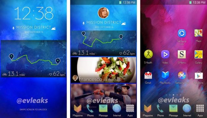
Remember those awesome screenshots that were leaked about a year ago? The leaked screenshots showcased a radical new smartphone UI, which was much different from TouchWiz at that point of time. However, we guesstimated that it was a work of a designer or a fanboy, not actually made by Samsung. When Samsung released its recent flagship offerings, the Galaxy S6 and the Galaxy S6 edge, it was a clear indication that the company is unwilling to make radical changes to its software interface, at least this point of time.
Now, a designer who claims that he worked with Samsung and their creative team on an experimental UI/UX “to explore new ways of interacting with your phone” has released his work through a video. A minute long video showcases some cool animations and pastel colored icons. The other 10-second long video shows various iterations of the software side-by-side. So those leaked screenshots weren’t fake after all, but it’s apparent Samsung decided not to go with the redesigned UI in the end, possibly because it wanted to go one step at a time and focus on the hardware redesign first.
Go ahead and check out the videos embedded below.


