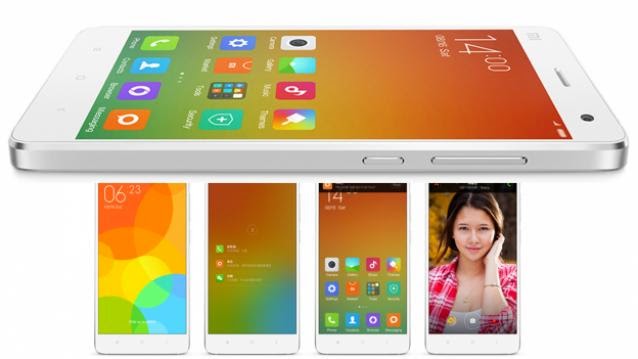
Xiaomi has announced MIUI 6, the latest version of its popular custom Android UI, bringing a design change that will have more than a few people thinking of iOS 7.
A more colourful, minimalist interface with supposedly enhanced security features awaits developers who have booted the new OS. Devices such as the upcoming Mi 4 and hotselling Xiaomi Mi 3, will receive the MIUI 6 official update in the next couple of months after another round of developer testing.
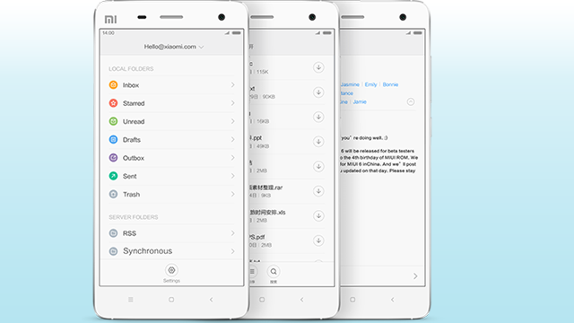
Xiaomi claims to have made MIUI 6 less distracting and there’s definitely a big change when you compare the existing MIUI5 to the upcoming version. Xiaomi has chosen to use big white spaces accented with bright colours within its core apps, which immediately call for comparisons with iOS 7. In particular, the calendar, mail apps and the gradient-heavy icons remind us of Apple’s mobile OS.
A lot of the skeuomorphic or real-world design elements have been toned down, which is evident in the clock, and calculator app, both of which sport a much cleaner look now. Similarly the camera app has been toned down, with the big target buttons replaced by clearer targets that float on the screen. It does add a great deal of cleanliness to the camera UI, which earlier had broad bands on top and bottom with the icons.
The lockscreen has changed as well. MIUI 6 shows you the number of pending notifications on the lock screen and users can get to the app showing it directly by pulling up on the number. Xiaomi has also added non-intrusive notifications for incoming calls and messages when you are already doing some other task.
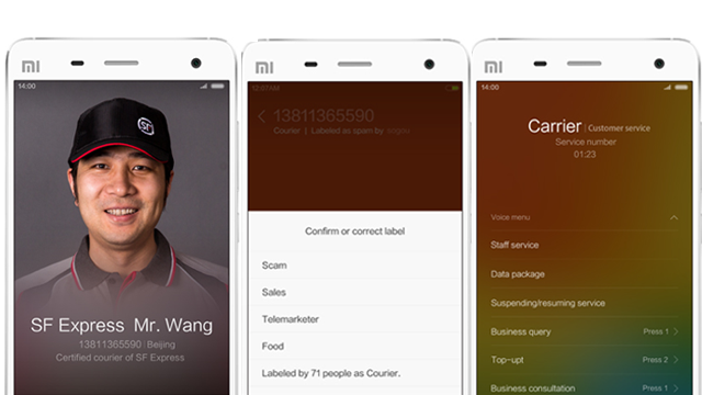
It’s not just the looks that have changed. The dialler app for example has been greatly enhanced. Now MIUI will show you caller ID for unknown numbers a la TrueCaller out of the box. In addition you can mark certain service numbers and also manage your carrier’s customer care hotline through the dialler, removing the need for you to listen to machine recording when getting in touch with them.
This wouldn’t be MIUI without a bunch of themes for the new version, but right now we expect only the few themes that the company has created in the new OS. As developers soak themselves in the testing, we could see more themes pop out.
Of course when it comes to Xiaomi, the big controversy is about how the company tries to copy Apple in its hardware and software design. Apple was by no means the first company to introduce a flat UI design, but it did get a lot of attention for its major redesign last year.
It certainly doesn’t help that Xiaomi’s website for the new OS and its use of pictures is very close to Apple’s own website. So we are not surprised that many people are calling MIUI 6 a straight iOS rip-off, but there are some interesting features that are exclusive to MIUI such as customisable notification toggles, the themes store and the comprehensive permissions manager. So yes, there are similarities but there are enough differences for us to not just talk about MIUI 6 as an iOS 7 rip-off.


